2025-09-29 23:27:04|Myriagame |source:minecraft skins
Today, VS.com officially launched a new version of the Steam store interface, ending the previous testing phase.The new homepage is visually wider and simpler. It integrates the classification list on the left side of the past with the blue navigation bar at the top into a navigation bar, which supports direct browsing of specific game types such as racing and stealth, and will personalize recommendations based on user preferences.The overall layout is more in line with the operating habits of the mobile terminal, and the interface feels more intuitive and smoother than the old version.
However, there are differences in community feedback.Some players believe that the new version of the interface icon is larger, has less information, and has more operation steps, which is obviously a compromise with the mobile terminal, reducing the efficiency of the PC terminal.There are even players on Reddit pretending to be "an old lady who uses an old Samsung touchscreen tablet" to satirize the revision of V Club, which is more mobile and is not suitable for PC usage habits.But some people also said that the new classification label is finally clear and easy to understand, and the overall experience is significantly improved compared to the old version.

PC Gamer report original text:
I began to feel that I had too strong feelings for some of the minor changes in Steam.Why? Because when I heard that Valve finally changed the new store interface from beta, I immediately clicked on the website as fast as I was sending candy for free.No one should care so much about the update of the website UI, but I just do.This is my own "cross".
In short, Steam's store front end has been officially launched, and the homepage now looks smoother and wider.Valve merged two parts of the old UI—the long list of categories on the left and the blue navigation bar at the top—to a more accessible navigation bar.
In this new merged navigation, the “Category” section finally shows the real category.In the past, when you were in the sidebar, the "category" you could click was just a list of "hot-selling items" and "newly released".Now, move the mouse to the new "Category" area and you can directly see more useful game types, which can easily browse by racing, stealth, etc.Moreover, these categories are personalized recommendations - you can think this is very convenient, or you can think that it is the "cold hand of surveillance capitalism" that stretched out again.Whatever you think.

I personally like this design, but I guess the hardest-core PC players may dislike it as obviously more mobile.In fact, the Reddit community's response has also been mixed.For example, user dogdillon wrote: "Thank you Valve, I am the grandma who uses a huge old Samsung touchscreen tablet." She may really be a tablet grandma, or it may be just a sarcasm.Another hooliganmike complained: "Another update has made the PC experience worse for mobile. The icons are larger, the information is less, and the menus are more..."
But at least some people like this update.User Xedronic said, "Oh my God, this is really much better. The classification tag can finally be understood now!" As for me? I like it very much.At least I used to hate the old version of the interface, so now this update makes me feel like it is progress.Anyway, it would be nice to get a bargain: at least Valve hasn't stuffed an "AI Assistant Chat Box" on it.
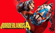
"Borderlands 4" ranked secon
2025-10-04 21:51:10
The new game "The Lord of th
2025-10-04 21:51:07
EA sold Former BioWare emplo
2025-10-04 21:51:05
"Material World 2" new trail
2025-10-04 21:51:02
New demonstration of the for
2025-10-04 21:50:59
Wilson remains EA CEO, pledg
2025-10-04 21:50:57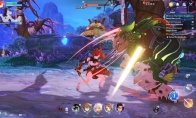
The new Sword Spirit derivat
2025-10-04 21:50:54
"Fortnite" announced the rem
2025-10-04 21:50:52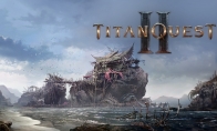
"Titans Journey 2" Chapter 2
2025-10-04 21:50:49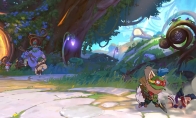
"League of Legends" fighting
2025-10-04 21:50:47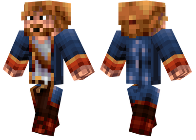
Pirate Minecraft Skins
Minecraft Skins
2024-12-10 04:11:27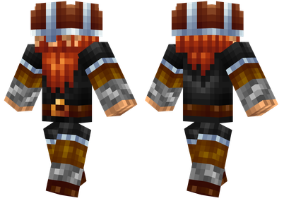
Pirate Minecraft Skins
Minecraft Skins
2024-12-10 04:11:26
Master Minecraft Skins
Minecraft Skins
2024-12-10 04:11:25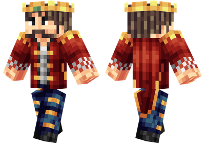
King Minecraft Skins
Minecraft Skins
2024-12-10 04:11:25
Guide Minecraft Skins
Minecraft Skins
2024-12-10 04:11:24
Dark Knight Minecraft Skins
Minecraft Skins
2024-12-10 04:11:23
Sparta Minecraft Skins
Minecraft Skins
2024-12-10 04:11:23
Moncraft Skins of the War
Minecraft Skins
2024-12-10 04:11:22
Red Witch Minecraft Skins
Minecraft Skins
2024-12-10 04:11:22
Golden Cavaliers Minecraft S
Minecraft Skins
2024-12-10 04:11:22