2025-01-27 11:34:48|Myriagame |source:minecraft skins
"I joined Tencent on January 18, 2005. I have been working here for more than 11 years, but I still can't keep up with the age of QQ." Andraw, the design director of Tencent isux (social user experience).
QQ penguins should be the most well -known image in the Internet industry. It accompanies the entire process of "touching the Internet" with many people.
What you may not notice is that this penguin is 17 years old; in 17 years, its image has changed 5 times, from the thin and long matters, the fat red scarf penguin, the silhouette version of the penguin, and now it is even moreEach change of flat and neutralized penguins represents a new design trend, and even reflects the different stages of development of the Internet.
Andraw (Andraw) led the changes in the image of the QQ penguin several times, so we talked to him and knew the story behind many cute penguins.The following is the Q & A actual record:
(PW = Pingwest Play, A = Dai Yongyu (Andraw))
PW: In 1999, why did QQ choose penguins as logo?

A: I joined Tencent on January 18, 2005. I have been working for more than 11 years, but I still can't keep up with the age of QQ, so I know the previous things.Choosing penguins should be mainly considered by the boss. At that time, there was also a penguin image internationally, and the penguin image was later set.At that time, the company had no full -time designer.
PW: In 2000, penguins became fat, why?
A: In 2000, the outsourcing team specially designed this image.In the impression of the Chinese, fat represents festive festivals, such as Maitreya Buddha.This change was very successful, and the red bib was added, and it suddenly became hot.

PW: Is there any official statement about the red bib?
A: No.I think Penguin lives in Antarctica, and the bib will give people a warm feeling, and it must be red.
PW: The next change image is 2006. What are the main changes?
A: The fat penguin in 2000 is actually asymmetric. If you look closely, you will find that it is a little crooked.It will be funny and interesting now when I look back.In 2006, we made penguins more symmetrical, more neat, and more like a logo.

In addition, penguins in 2000 are plane, without gradient and texture. In 2006, we added the three -dimensional texture effect of the bright crystal.This is mainly led by Apple. At that time, there was no iPhone, but the crystal three -dimensional texture on the Mac system was very popular.
PW: Why did you add a mouse to the two letters of QQ?
A: This is also a classic.This was designed by the outsourcing company in 2000.At that time, the mouse represented a new computer era.But then we felt that the mouse was out of date, and it was removed in 2012.
PW: 2012 should be a relatively aggressive change. I am now impressed by that silhouette.
A: Because we have been doing QQ for a while, many competitors have appeared. The main competitors at the time were MSN.We found that the advantage of QQ is a good memory, Q, very cute, but it is easy to make business people think that it is played by children and cannot represent their identity.We want to make these high -end people a target user, and the company has always said that don't do too much tendency to be an aging market.

So I tried a more concise and more design style at that time.QQ in 2012 is very pure, including the main color of the blue color, also a very clean feeling, the typesetting is also clearer.
PW: At that time, "Polar Snow" was even part of the brand?
A: Yes, the design concept at that time was because the penguin itself lived in the Antarctic, which was very pure.
PW: What considerations are the penguin of the silhouette?
A: This was designed by me. At that time, I spent a lot of thoughts.In fact, not only the penguins, but also the logo of QQ.com and IM.QQ.com have adjusted, the video and voice interface have also been changed, and it is cleaned and more silhouette.At that time, we used a lot of extreme photos to settle the purity of QQ, and the silhouette looked very clean.

QQ 2012 landing interface
National Service DNF Dark Ni
2025-01-28 09:19:27
The new screenshot of the be
2025-01-28 09:18:57
The 15th anniversary wallpap
2025-01-28 09:18:27
3DM Xuanyuan Sinicization Gr
2025-01-28 09:17:57
French magazine is the first
2025-01-28 09:17:27
The sneak game "Republic" wi
2025-01-28 09:16:57
The story between humans and
2025-01-28 09:16:27
Capture "Trinity 3: Artifact
2025-01-28 09:15:27
Wind direction change "Myste
2025-01-28 09:14:57
DICE's new project "Dream" w
2025-01-28 09:14:27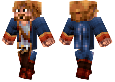
Pirate Minecraft Skins
Minecraft Skins
2024-12-10 04:11:27
Pirate Minecraft Skins
Minecraft Skins
2024-12-10 04:11:26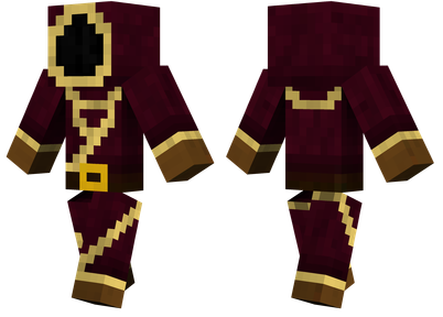
Master Minecraft Skins
Minecraft Skins
2024-12-10 04:11:25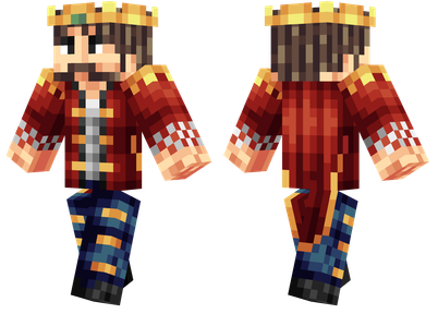
King Minecraft Skins
Minecraft Skins
2024-12-10 04:11:25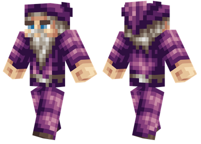
Guide Minecraft Skins
Minecraft Skins
2024-12-10 04:11:24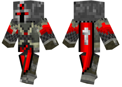
Dark Knight Minecraft Skins
Minecraft Skins
2024-12-10 04:11:23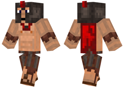
Sparta Minecraft Skins
Minecraft Skins
2024-12-10 04:11:23
Moncraft Skins of the War
Minecraft Skins
2024-12-10 04:11:22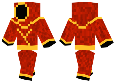
Red Witch Minecraft Skins
Minecraft Skins
2024-12-10 04:11:22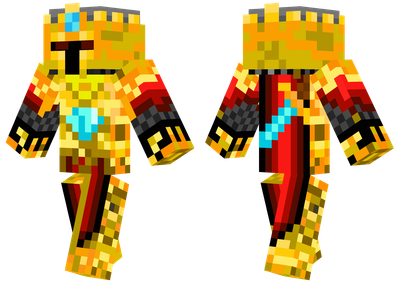
Golden Cavaliers Minecraft S
Minecraft Skins
2024-12-10 04:11:22